
Services
Design Consulting
Creative Art Direction
Digital Branding
User Interface Design
Content Creation
Illustration
Client
EDEKA Stiftung & Co. KG
Platform
Smartphone (iOS and Android)
A redesign of two apps into one.
The assignment for the supermarket corporation EDEKA, the largest German food retailer, focused on a complete redesign and on merging the two existing apps, the »EDEKA App« and the customer loyalty app »EDEKA Genuss+«, into one. Both apps have been very popular since their release and are among the top 10 most used apps in the food & drink category of the German app stores.
On the basis of surveys with users, Björn Claussen, independent strategy and UX designer, came up with a new sitemap and optimized flows, united in one, contemporary app that largely meets the needs of every user: whether young or old, whether interested in checking new product offers or the opening hours of their favorite EDEKA market around the corner, collecting points for coupons or paying mobile with the app.
A redesign of two apps into one.
Services
Design Consulting
Creative Art Direction
Digital Branding
User Interface Design
Content Creation
Illustration
Client
EDEKA Stiftung & Co. KG
Platform
Smartphone (iOS, Android)
The assignment for the supermarket corporation EDEKA, the largest German food retailer, focused on a complete redesign and on merging the two existing apps, the »EDEKA App« and the customer loyalty app »EDEKA Genuss+«, into one. Both apps have been very popular since their release and are among the top 10 most used apps in the food & drink category of the German app stores.
On the basis of surveys with users, Björn Claussen, independent strategy and UX designer, came up with a new sitemap and optimized flows, united in one, contemporary app that largely meets the needs of every user: whether young or old, whether interested in checking new product offers or the opening hours of their favorite EDEKA market around the corner, collecting points for coupons or paying mobile with the app.
Rebranding
For the comprising standardization and recognizability of the visual brand it was essential to implement EDEKA's entire corporate design – which is widely known from TV and print campaigns – into all digital channels.
Visual Unification
Isabel Pettinato embedded a screen-optimized version of the original blackboard texture and cleaned up the functional layout by removing unnecessary textures and distracting decorations.
She retained the condensed corporate font »Plak« for headings and prices, but integrated a new, well-readable typeface for all smaller text elements, the screen-optimized Google font »Fira Condensed«.
Accordingly all icons and illustrations with the significant chalk lines got also a contemporary rebrush.
Imagery
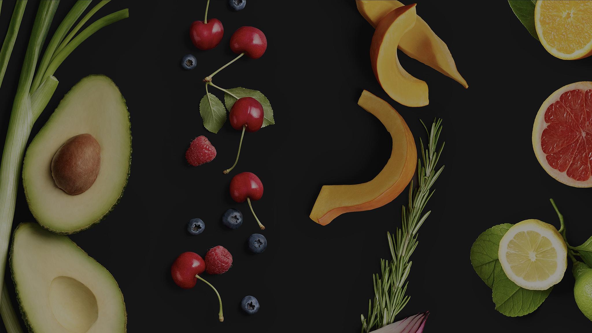
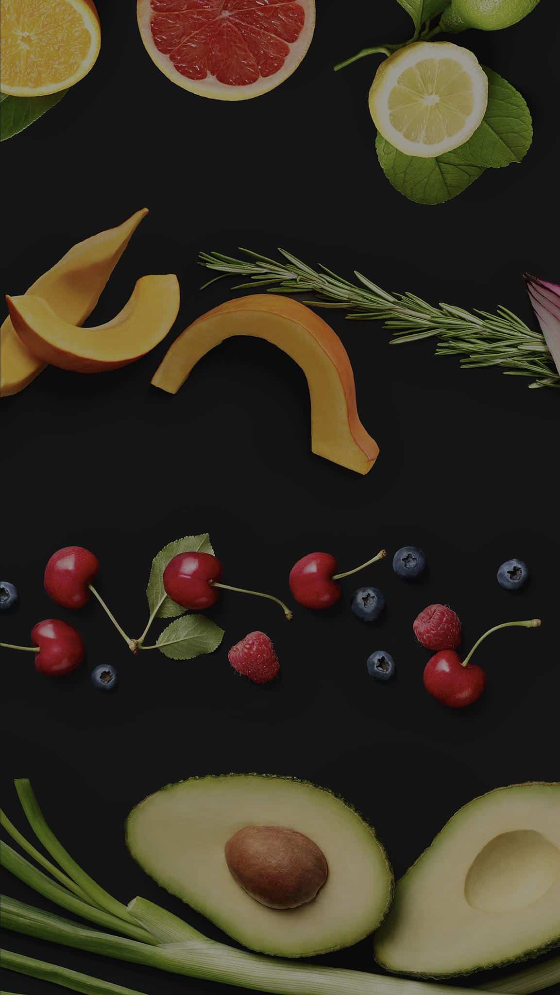
EDEKA's trademark in its TV and print campaigns is an opulently arranged collage of vegetables and fruits on a dark blackboard background.
Through the holistically thought-out, visual optimization, Isabel Pettinato created an appealing, reduced design environment that is ideally complemented by the high-contrast photographs of the food, which have the characteristics of an artistic still life. Furthermore she elaborated a complete imagery and text concept that works as well as for all app images, background pairings as for empty states.
Art Direction On-Set
Based on the art direction and the ongoing evaluation by Isabel Pettinato the photo shooting was executed by photographer Reinhard Hunger and food stylist Volker Hobl. They collaged every motif of fruits and vegetables four times for the four seasons. The images have been post-processed by sevengreen picture works GmbH, a post-production studio in Hamburg.
Realization
Depending on the time stamp, the relevant food of the current season is displayed as graphic asset in the background of the interface.
The visual challenge during the shooting was to find the right, aesthetic balance between EDEKA's typical, playful decor and the highly functional app interface as too much decoration could be distracting and interrupt the user's behaviour. The technical requirement afterwards was to embed the background assets at the perfectly defined position on any device with different screen size.
Redesign
The redesign of the newly created EDEKA app focuses on detailed realignment regarding design theming and content.
Color Scheme
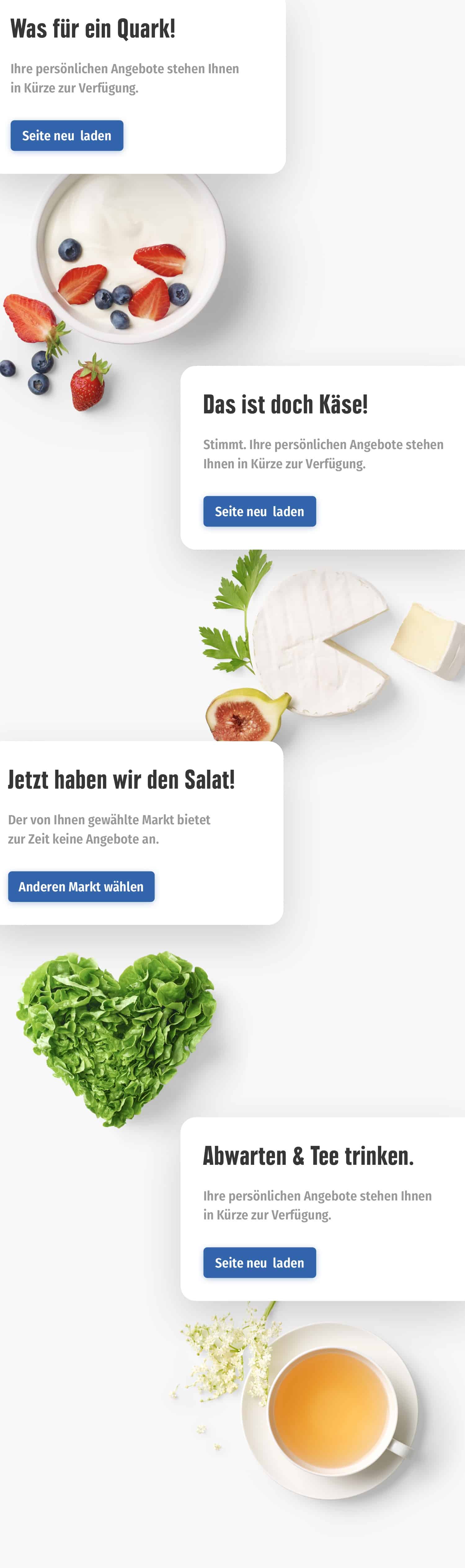
Regarding varying user behavior it was particularly important to strengthen the users' orientation with a consistent and logical usage of EDEKA's different color schemes. Isabel Pettinato integrated the light coloring of the existing offers' module from the EDEKA website and kept the learned, dark theme of the couponing section from the »Genuss+« app.
Distinguishable Teasers
The two, above mentioned sections of coupons and product offers – teasers that looked identical before – should become instantly distinguishable. By redesigning the offer teasers with the help of more prominent product images and a vertical structure, both teaser modules became easily identifiable from each other.
Wake-Up Design
Forms, lists and highly functional modal views were designed with a light background, while branding and advertising content, general announcements and intros got the typical EDEKA chalkboard look, the so-called dark theme.
Wake-Up Design
Forms, lists and highly functional modal views were designed with a light background, while branding and advertising content, general announcements and intros got the typical EDEKA chalkboard look, the so-called dark theme.
Design Consulting & QA
Throughout the redesign's implementation phase Isabel Pettinato continuously supported both development teams by testing the coded design, consulted the marketing team from her designer's perspective and revised the app's interface regarding technical or custom-oriented specifications.
Style Guide
For an easy, future onboarding of designers at EDEKA and as a reference work for all team members, Isabel Pettinato finally summarized all defined design patterns, redesigned UI elements and components into a comprehensive mobile style guide.
