
Services
Design Consulting
Creative Art Direction
Digital Branding
UI / UX Design
Content Creation
Client
PIA Group
Platform
Web
The PIA Group is an agency network and combines strategy, creativity and technology into data-driven marketing.
Isabel Pettinato was commissioned as creative team lead with the purpose to give shape to the agency's synergetic processes. Her task was to present the company's strategic realignment in a compact and impressive one-pager.
Working closely together the creative team defined the narrative structure and the special features of the collective-like association. During the redesign of the company's website, Isabel Pettinato revised the corporate design to match the new identity and turned it into a retro-modern style.
In terms of sustainability, it was a priority to keep the new site's C02 emissions as low as possible, for example by using lightweight content, lazy loading and only a few fonts.
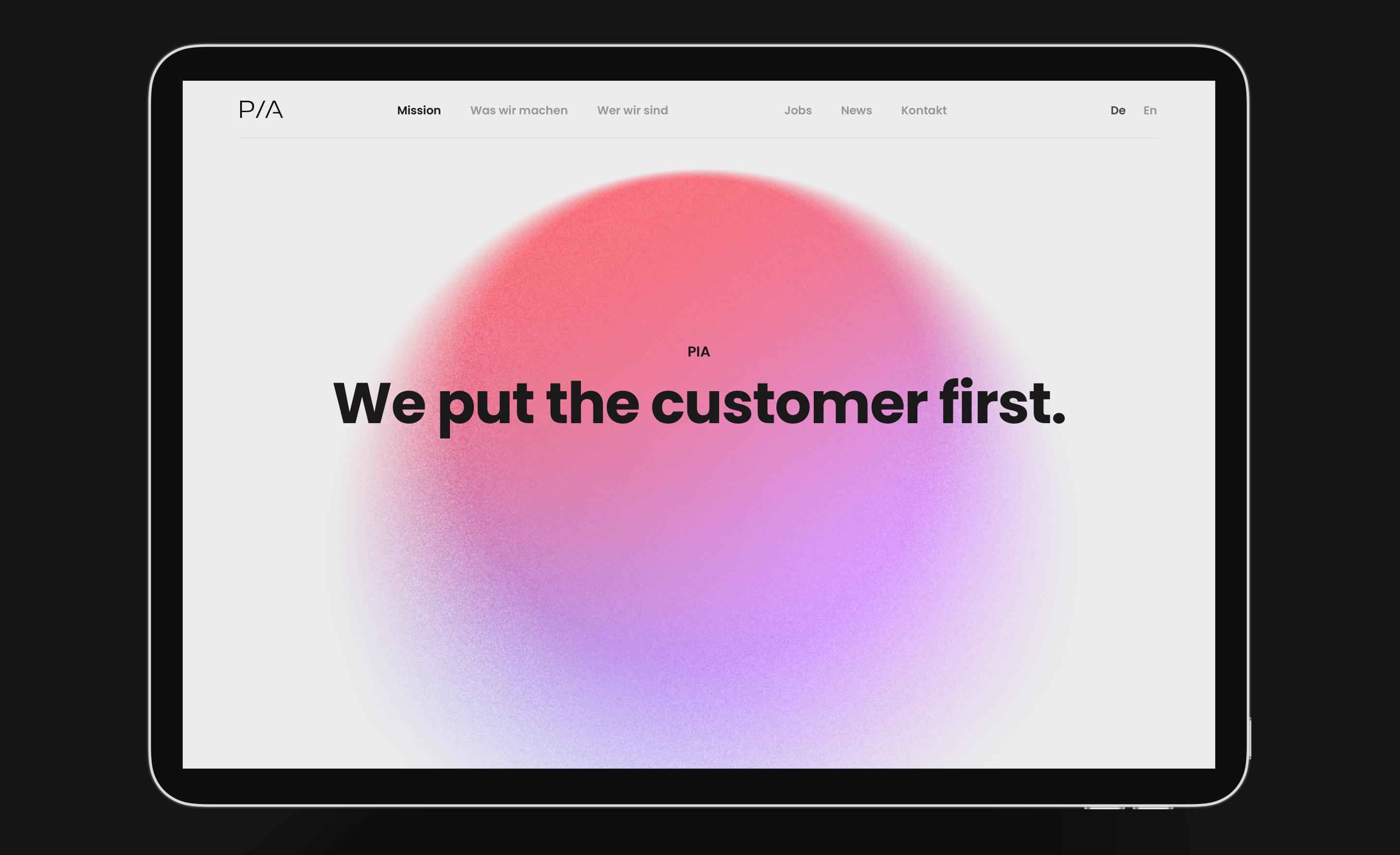
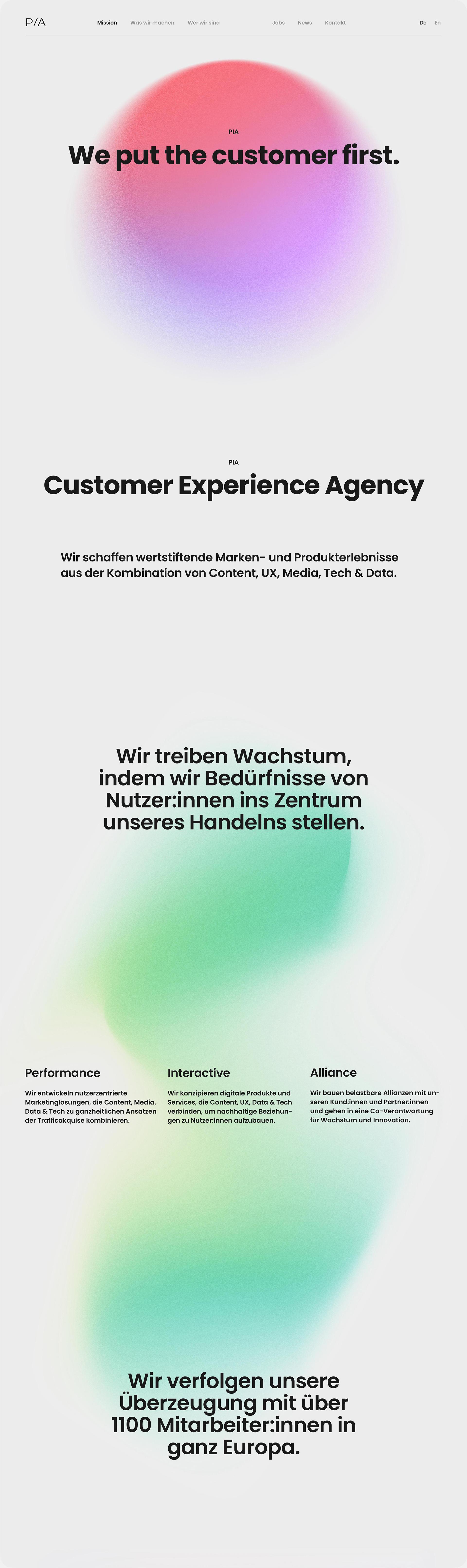
Synergy made visible.
Services
Design Consulting
Creative Art Direction
Digital Branding
UI / UX Design
Content Creation
Platform
Web
Client
PIA Group
The PIA Group is an agency network and combines strategy, creativity and technology into data-driven marketing.
Isabel Pettinato was commissioned as creative team lead with the purpose to give shape to the agency's synergetic processes. Her task was to present the company's strategic realignment in a compact and impressive one-pager.
Working closely together the creative team defined the narrative structure and the special features of the collective-like association. During the redesign of the company's website, Isabel Pettinato revised the corporate design to match the new identity and turned it into a retro-modern style.
In terms of sustainability, it was a priority to keep the new site's C02 emissions as low as possible, for example by using lightweight content, lazy loading and only a few fonts.
Rebranding
The unmodified, filigree logo is given high-contrast company of a bold typeface in massive letters, bright colors and abstract shapes of particles. The new, clean design underlines the message of a connecting, transparent way of interdisciplinary cooperation with focus on high efficiency.
Color Scheme
The original color palette has been reduced. The saturation and temperature were increased for more emotional expressiveness in the almost image-free layout.
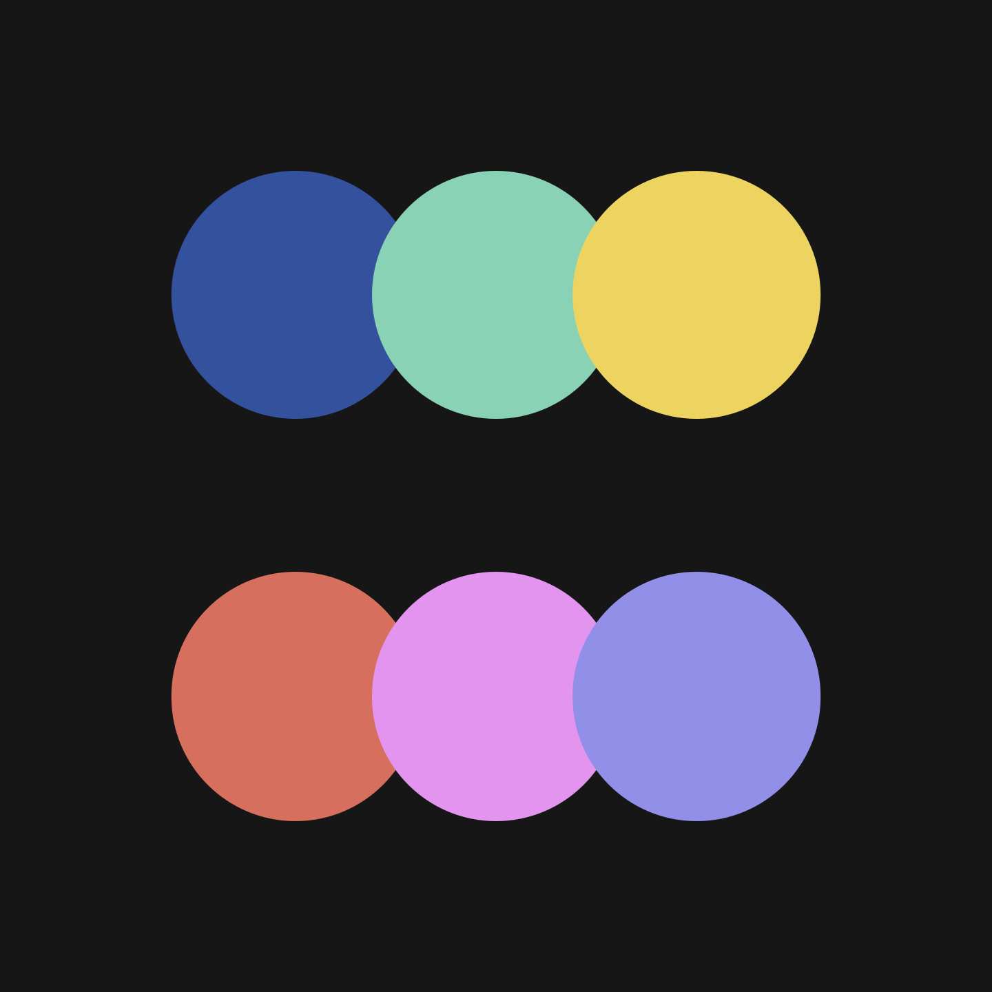
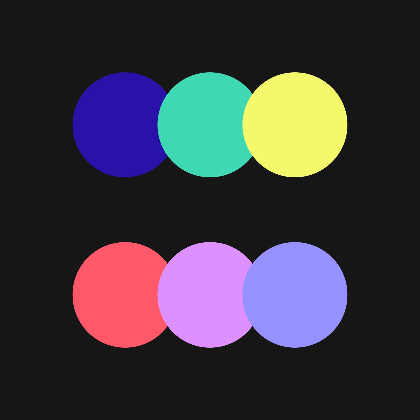
Color Gradients
The new colors were combined with each other according to the natural color spectrum to form harmoniously defined color gradients without unwanted nuances inbetween.
Typography
Isabel Pettinato selected the geometric, sans-serif font »Poppins« by Google as new corporate font for PIA. Its slightly retro character looks as clear as open-minded and matches stylistically the halftone effect of the forms and black-white photographs.
Visual Metaphor
PIA's way of working and the resulting synergy reminded her of the swarm phenomenon. Swarm intelligence refers to the design and use of self-organizing systems that dynamically adapt to the respective environmental needs.
Imagery
Derived from the swarm idea, she defined abstract shapes and particle-like, grainy textures as visual language.
Photography
The vivid effect of the colored shapes is enhanced with the use of black-white photography throughout the site. All photographs are also provided with a similar grain effect as the graphics and therefore continue and repeat visually the metaphor of the swarm-like synergy.
Redesign
The starting point for creating the new site's architecture and design was the swarm-like interplay of all service sections that together make up PIA.
Visual Structure
For an one-pager Isabel Pettinato scripted the corporate facts in defined chapters, which stand for themselves and complement each other. The minimalistic layout, reduced content and the slide-per-slide-scrolling effect are intended to simulate a compact keynote presentation in the browser.
Scrolling Directions
The one-pager consists of chapters, in the layout vertically structured. The contents are controllable by horizontal scrolling within the sections as used in the references' and agencies' galleries. The strict division of the two scrolling directions gives the user adequate orientation within the site architecture.
The Circle
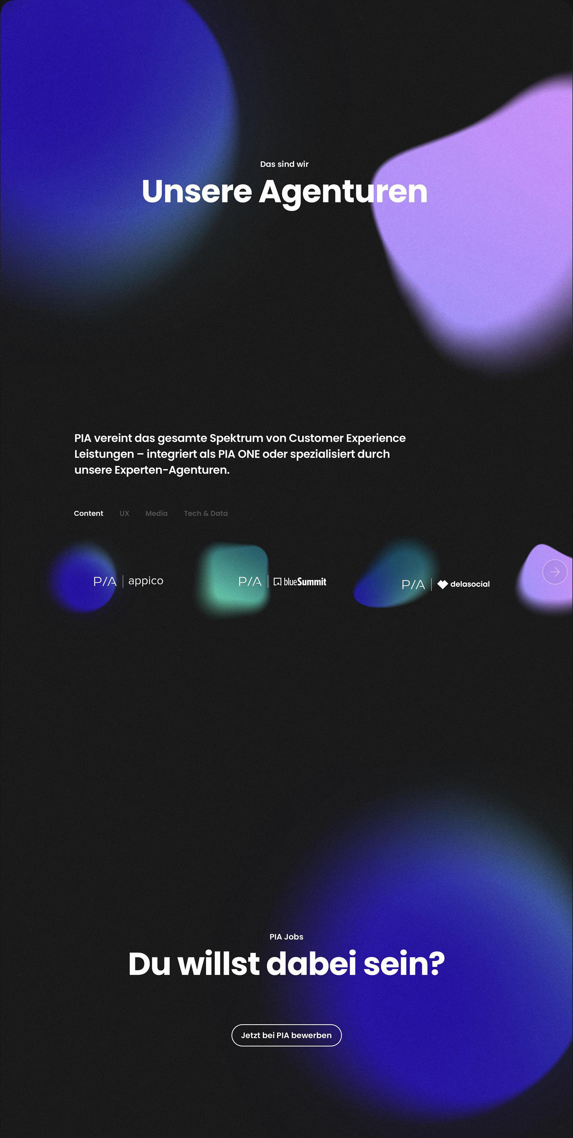
The PIA circle is made up of its service sections such as »Strategy«, »UX«, »Content«, »Media« and »Tech & Data« and was conceptually provided by client from the start of the project.
Animated by Kevin Jäger, an independent motion designer, the circle is the symbol for the synergetic processes within PIA. While scrolling, the individual service sections and their descriptions are presented as sub-areas of the circle.
Design Theming
The use of light and dark theme as a narrative play with contrast: the sections of PIA's services and company structure are displayed in the white light theme, while the individual agencies as well as the job section are shown in the dark theme.
Art Direction Photography
In accordance with the highly abstract visual language of the company's synergies and the minimal layout, Isabel Pettinato recommended a break in style for the team portraits in terms of individual liveliness and closeness. Each employee should have the freedom to pose and dress in the way that makes them feel most authentic.
Processed in black-white and with a subtle grain, the photographs complement the corporate design in a classic, reduced and at the same time casual and contemporary manner.
Creative Direction
Accompanying her core services such as Branding, UI/UX design and Design Consulting, Isabel Pettinato led the PIA design team regarding implementation, production and development of the website. She transferred the new corporate design into the keynote presentation templates and set up an online style guide.
